Modus Essendi
A magazine I created as an afterthought, to a project I made for my second semester exam.
This magazine concept is created, to experiment with typography. I wanted to do a project where I could work with layout of larger amounts of text – creating different layouts according to the subject matter.
I created it as an extension of a project, I made for an exam.
Problem
Creating a magazine about creativity.
Audience
Primarily: “Everyday people” who are interest in creative expression, but not actively doing art projects or working within the creative industry.
Secondly: “Career creatives” who work within the art or creative industry.
Content
– Concept introduction
– Suggestions for recurring content
– A concept version of the magazine, displaying the layout.
Introduction and concepts
Concept magazine
An example, used to show how the magazine should work with layout, depending on the content. Giving the content about creativity a more free layout, one might recognize from poem collections, and the business related content a more straightforward layout, but still with its own style.
I developed the text, by roughly outlining the overall subject matter, the direction, and the conclusions in a prompt.
I then used ChatGPT to create the copy.
Content for articles
Focus on a century

I created this collage for the “focus on a century article”, combining imagery of war, abstract art and a map of New York.
Used to express the key aspects of the article.
To keep a visual cohesion, I decided to make a single collage, dividing it in two, and using it at different points of the magazine.
This part of the collage is used as the first and primary image for the introduction of the article.


This second part, which is much lighter, is used to create contrast in the magazine, where I placed it on a dark blue background.
Album cover
I created the album artwork for the album review, focusing on the brutalist architecture that the album revolves around.
I used an image of a brutalist apartment complex with curved corners, as a symbol of the softer approach used to describe the brutal nature of the life within and around the buildings.

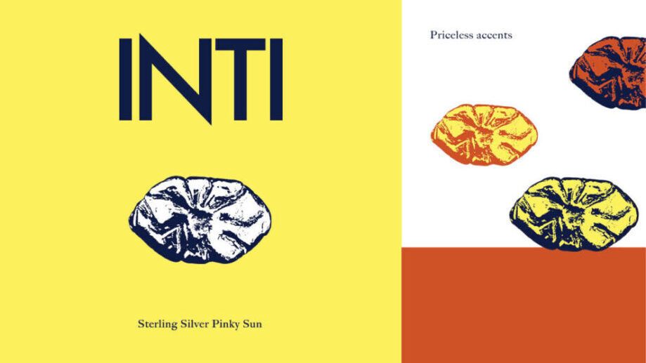
INTI
Case study experimenting with the creation of a jewelry brand, with only a single product as the catalyst.